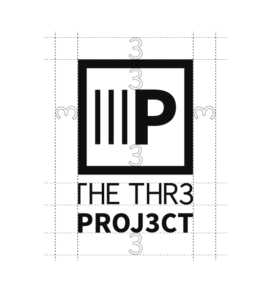
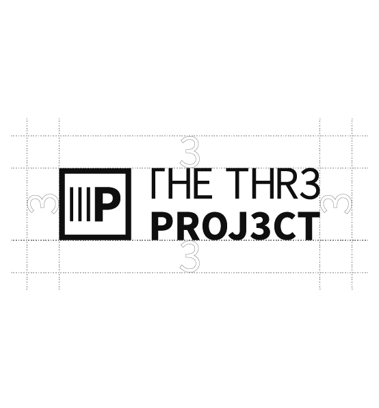
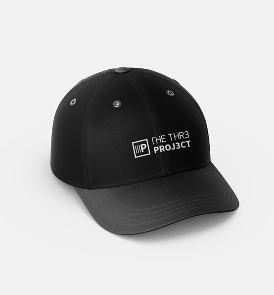
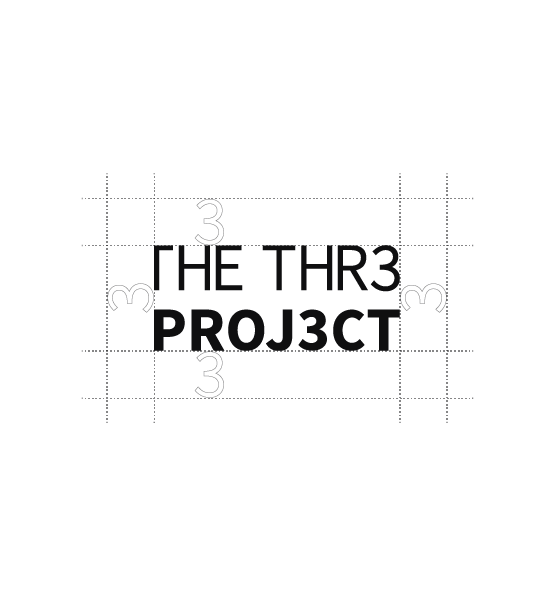
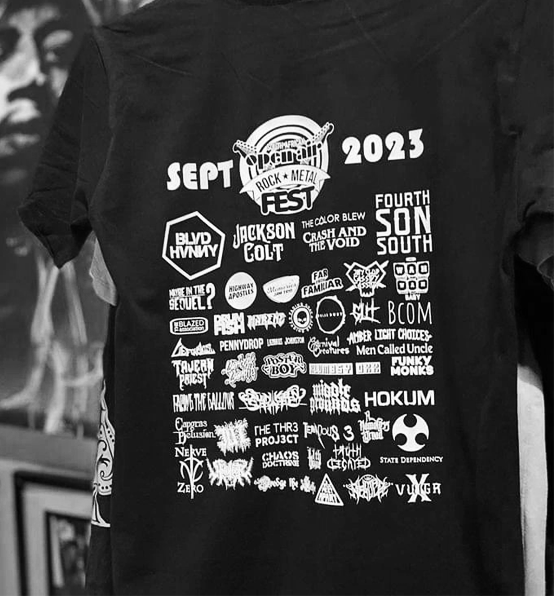
Your design must give top priority to the concept of negative space, which refers to the vacant areas surrounding our logo. Below, we specify the minimum amount of negative space that must be maintained. Adequate negative space is crucial for ensuring consistency and preventing a cluttered and ineffective design. You are encouraged to increase the size, as long as you don't reduce the suggested space.
We can accommodate variations in the logo's size, provided that the text remains clear and legible without requiring zooming. Please use the primary logo whenever possible, though a stacked version is available in case space constraints arise.
Alternatively, when the logo is scaled down significantly, consider separating the text from the main icon. The squared and rounded icon should only be used for supporting collateral like stickers, rather than representing the band itself. To prevent any disappointments, any merchandise or marketing materials, whether digital or printed, that represent or contain the brand must receive approval from the band before distribution.
The downloadable packs include the following variations in both a dark and light theme. It's important to have a solid grasp of when and how to utilize each variation.
PRIMARY LOGO
SECONDARY LOGO
WORDMARK
LOGOMARK
PRIMARY LOGO
Our primary logo serves as our most frequently utilized emblem. It serves as the foundational source for all other logo adaptations. This self-explanatory representation of our brand consists of both text and a singular icon or logomark. In any of its variations, the logo must be employed with the provided colors and is not to be modified or distorted in any manner.
Your design should prioritize negative space. The term refers to the empty space around our logo.
On the left, we indicate the minimum amount of negative space that must be applied. The appropriate amount of negative space ensures consistency and avoids cluttered and ineffective design.
STACKED LOGO
There may be occasions when you don't have ample space to accommodate our primary logo fully, but you still have a reasonable amount to work with. In such situations, our stacked logo comes to the rescue.
Considering the orientation of our primary logo, our vertical or stacked logo, often referred to as a secondary logo, points in a different direction, which can be more suitable for smaller to average-sized spaces. Our stacked logo adopts the inverse format compared to our primary logo. The purpose is to have both formats readily available for use in any medium that requires them.
In truth, the foremost factor to keep in mind is our band's name. Logos and catchphrases play a vital role, but they alone may not suffice.
Our band's name, and how it's spelled, serves as the beacon that spotlights our identity. It's what fans should engrave in their memory to connect with our music and other branding elements. It's the initial point of recognition that guides them towards thinking of us.
This is why our wordmark logo is indispensable in conveying the essence of our band: our band name.
Our wordmark embodies simplicity, and that's why we've meticulously considered the spelling and typography. It leaves no other elements for people to digest apart from our name and font, establishing a strong foundation from the outset. For more information, please refer to our documentary.
While our name imparts an evident impression, the subtlety of our typography and spelling operates beneath the surface. People might not consciously notice a font, but they can experience a subconscious reaction to it. That's why we've ensured that our typography is legible, distinctive, and perfectly aligned with our branding. Remember, "less is more" is a fundamental principle in all branding aspects, including names and visuals.
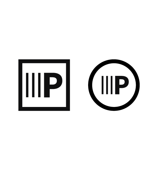
As previously discussed, our stacked logo is tailored for use in constrained spaces, while our submark logos or logomarks are designed for even more compact applications, fitting neatly within a square or circle. You might wonder why this is important. The reason is that these logomarks are specifically crafted for various social media platforms.
Many social media platforms follow a uniform practice of cropping images to conform to circular profiles. This standard shape is consistent across popular platforms such as Facebook, Instagram, Twitter, LinkedIn, TikTok, and most others. Therefore, the squared and rounded logomarks should be reserved for supplementary materials and not be used as the primary representation of our brand.
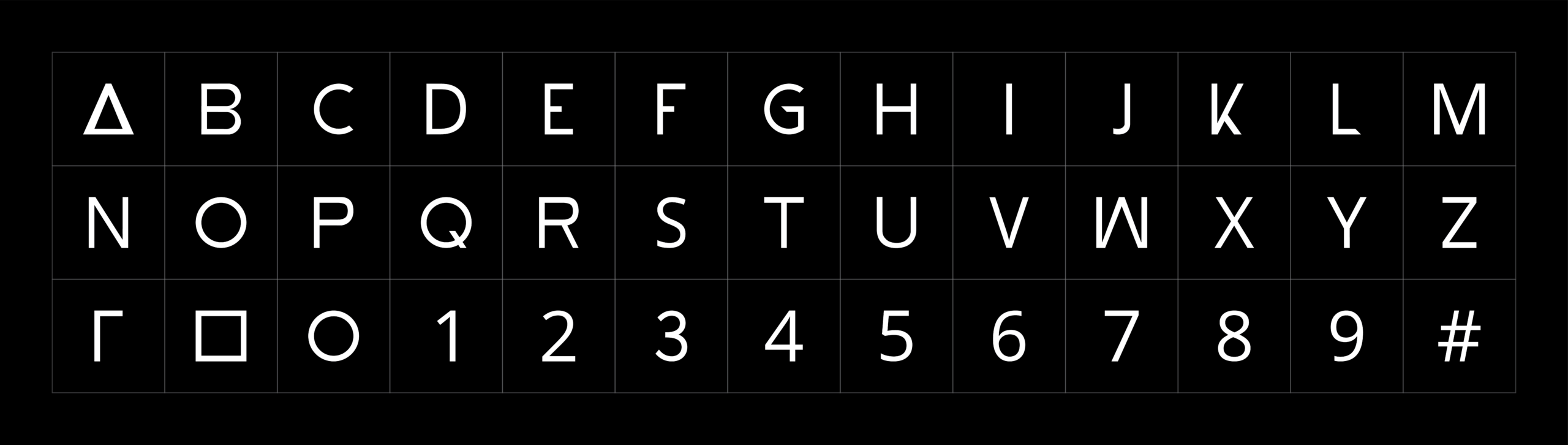
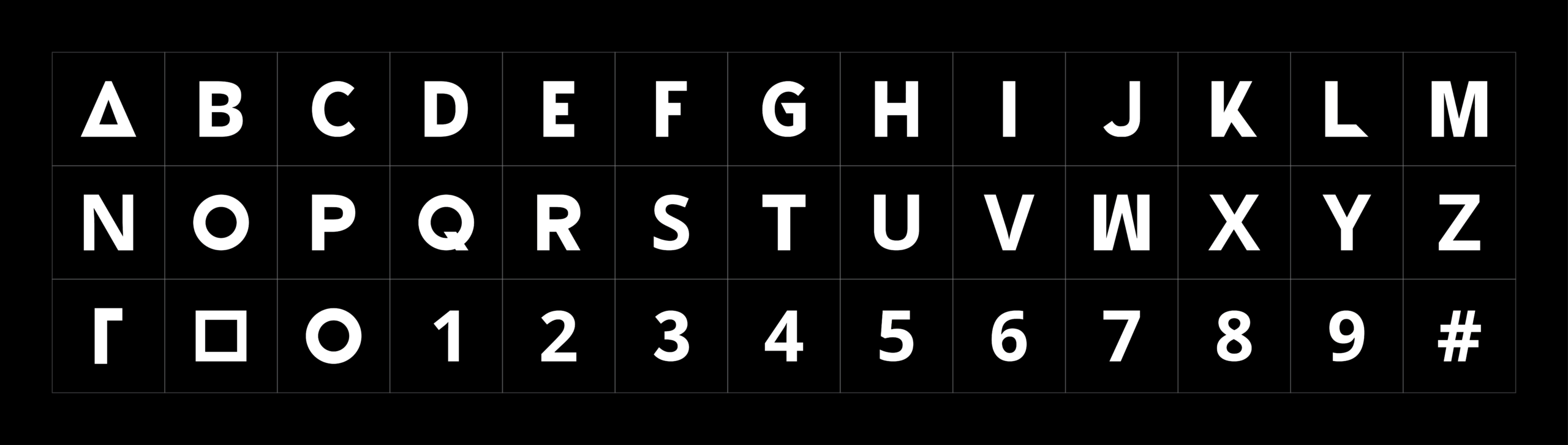
THE THR3 PROJ3CT possesses their exclusive typeface, known as THR3. This font was meticulously crafted to cater to the band's unique requirements. Several characters within the font encapsulate the principles and symbolism that define the band. Notably, the concept of "pronged" served as inspiration for certain shapes, where "pronged" denotes having a particular number of components or approaches.
Visual Inspiration
A single image possesses the power of a thousand words, harnessing remarkable and unparalleled potential for conveying complex ideas. These visual representations function as universal design interpreters, dismantling linguistic obstacles and entrancing their viewers. It's crucial to place a high value on a polished and aesthetically pleasing image when integrating our brand into festival or event artwork, and to cultivate a profound and relevant concept. When titling your event, make certain that the artwork harmonizes with the chosen name. Rather than hastily opting for a trendy free image, devote time and consideration to the selection procedure.
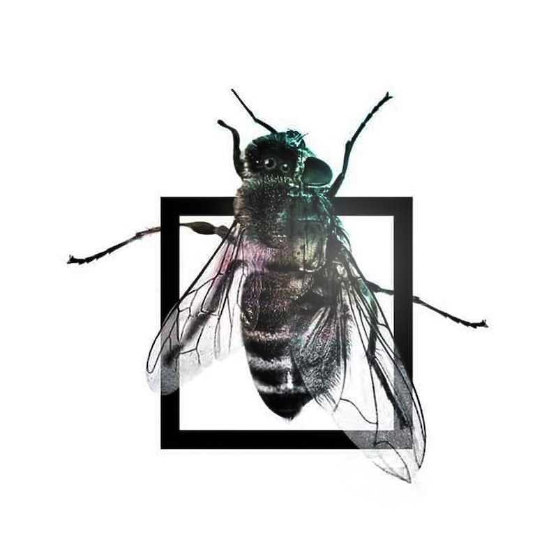
As depicted in the following images, we utilize visual art to communicate concepts and ideas to our dedicated fan base. The first image features artwork for our song "Multiverse," portraying a hybrid of a fly and a bee. The song explores the notion of a single entity existing in multiple parallel universes, symbolizing the duality of existence - the potential for both good and bad outcomes, the power to give life or the allure of death.
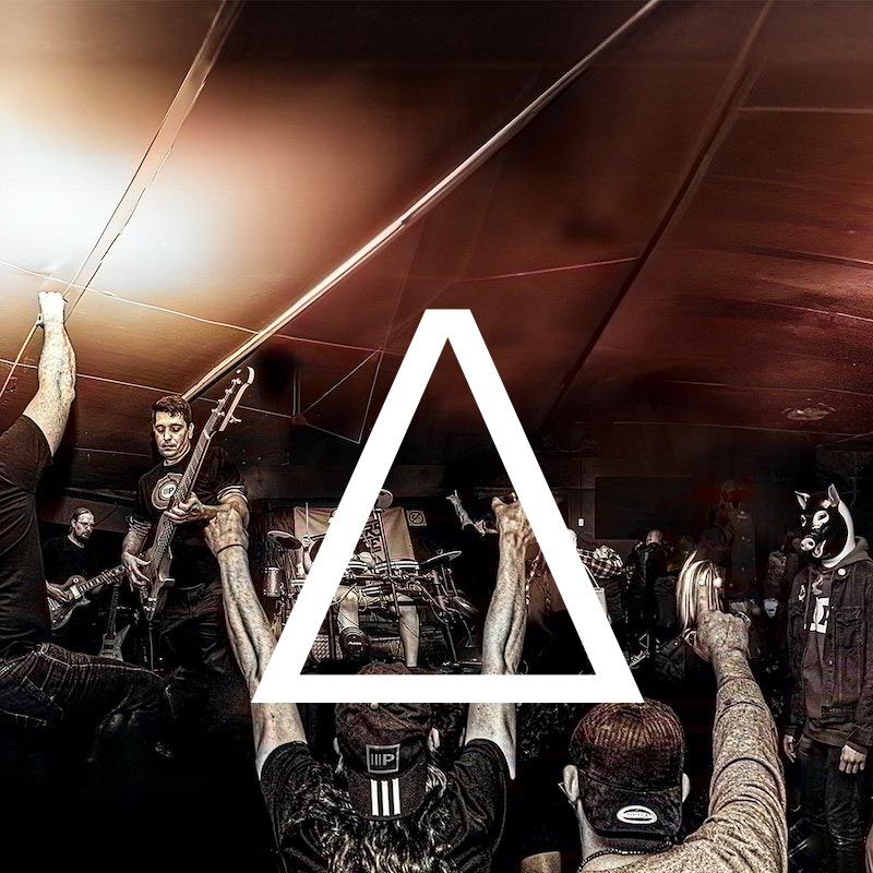
Next, we have the artwork for "Divided by Zero," a live recording that encapsulates the idea of fans enjoying themselves while we perform. It showcases genuine photographs of us in action at a festival, capturing the energy and enthusiasm of our live shows.
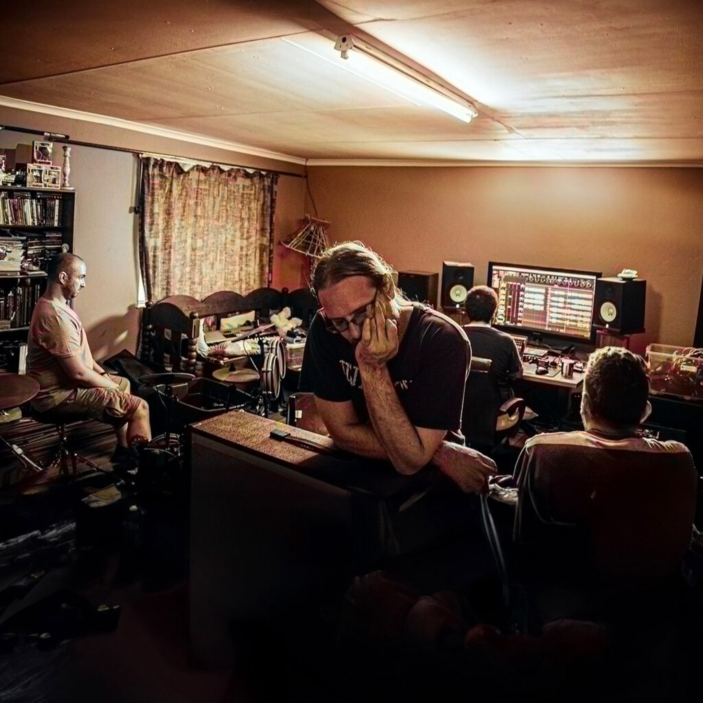
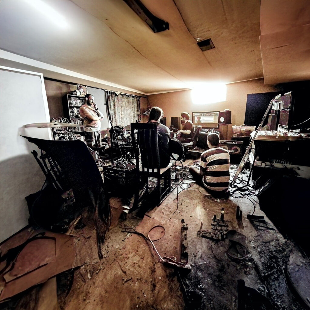
The last two images display manipulated photos taken during our recording process, offering a glimpse into the journey of rebuilding, particularly emphasized in our documentary, "[UN]ABRIDGED." These images convey the concept that our path to success has been marked by challenges and hardships, illustrating our resilience and determination.